ASAPP
ASAPP is an artificial intelligence cloud provider that was founded in 2014 with the mission of elevating contact center performance through the power of generative AI.
Brand Refresh - 2025
Early this year, ASAPP contacted Mitosis for a full rebrand. Their visual identity had become outdated and was underperforming against competitors. Mitosis conducted a full brand audit which included researching ASAPP’s existing identity, key competitors, and future industry trends. Together, we developed a refreshed brand system with a distinct color palette, typography, and photography style.
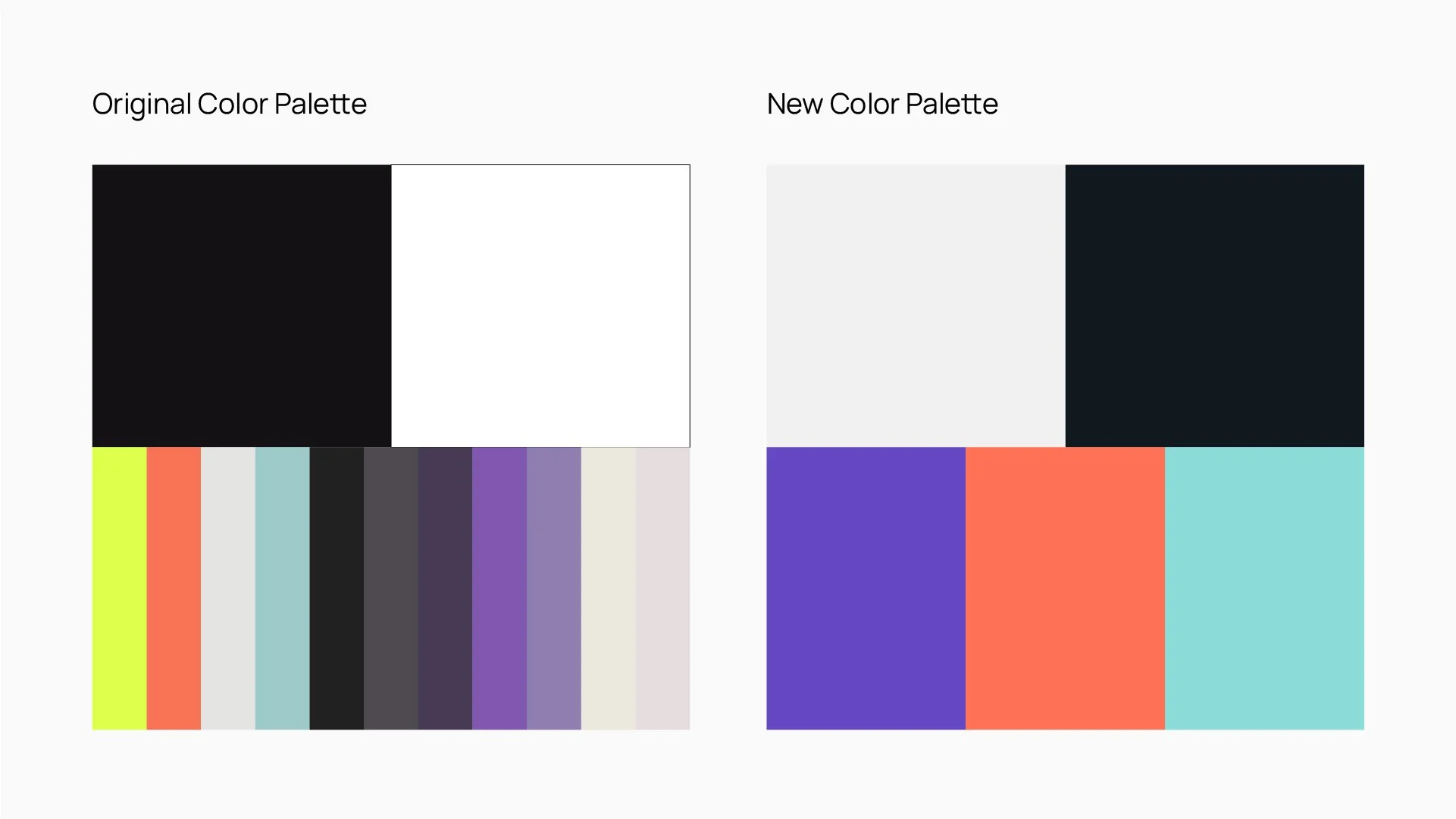
During the brand audit, we realized ASAPP didn’t need a full rebrand — it needed to evolve. We called the project Evolution to signify growth: their mission and values remained intact but were ready to advance.
To reflect that idea, I proposed keeping a few core hues from the original but strengthening them for better consistency and impact.
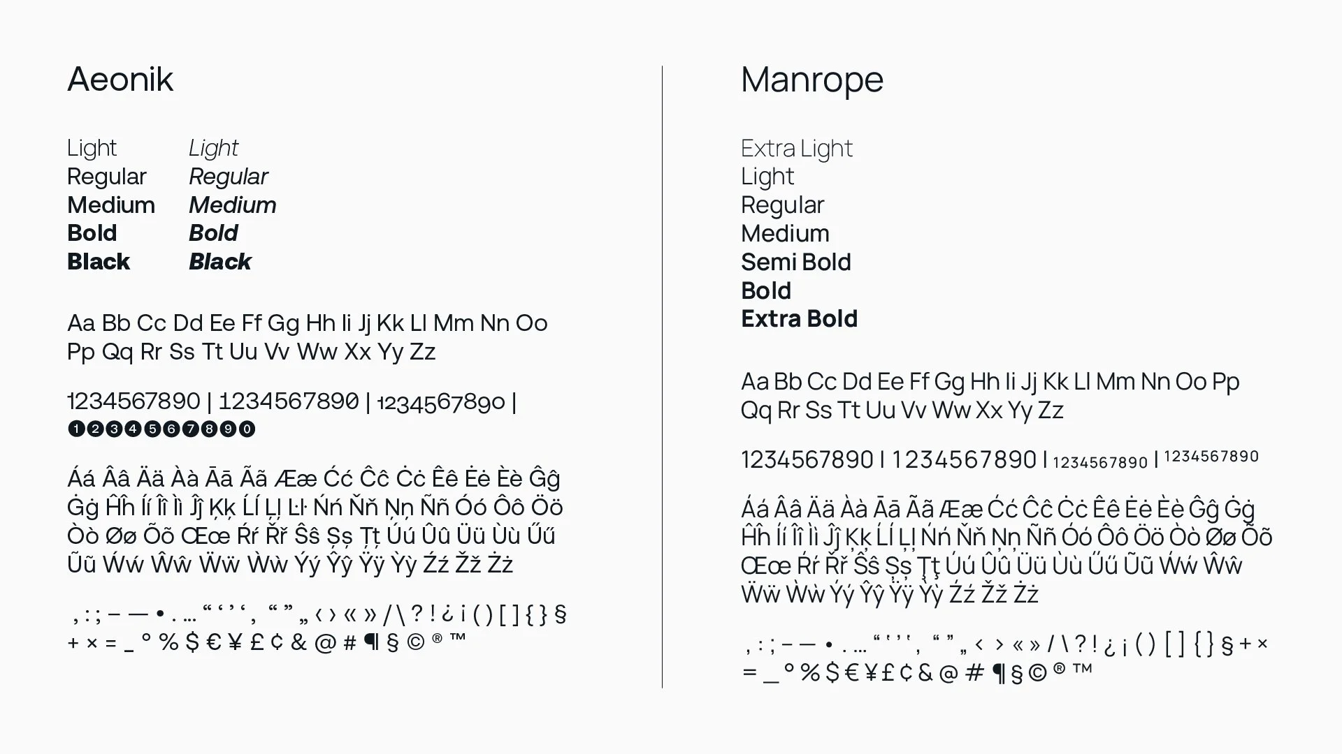
For typography, we explored Serif, Sans Serif, and Slab Serif options. Ultimately, we selected Manrope (Google Fonts), a clean Sans Serif that evolved naturally from their previous typeface, Aeonik.
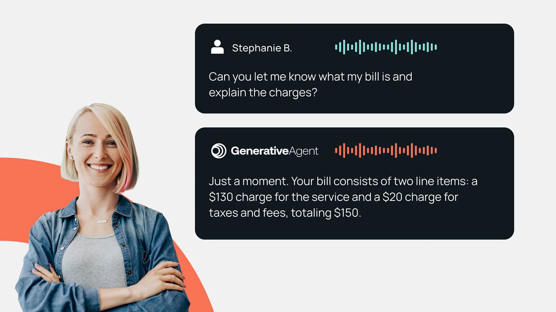
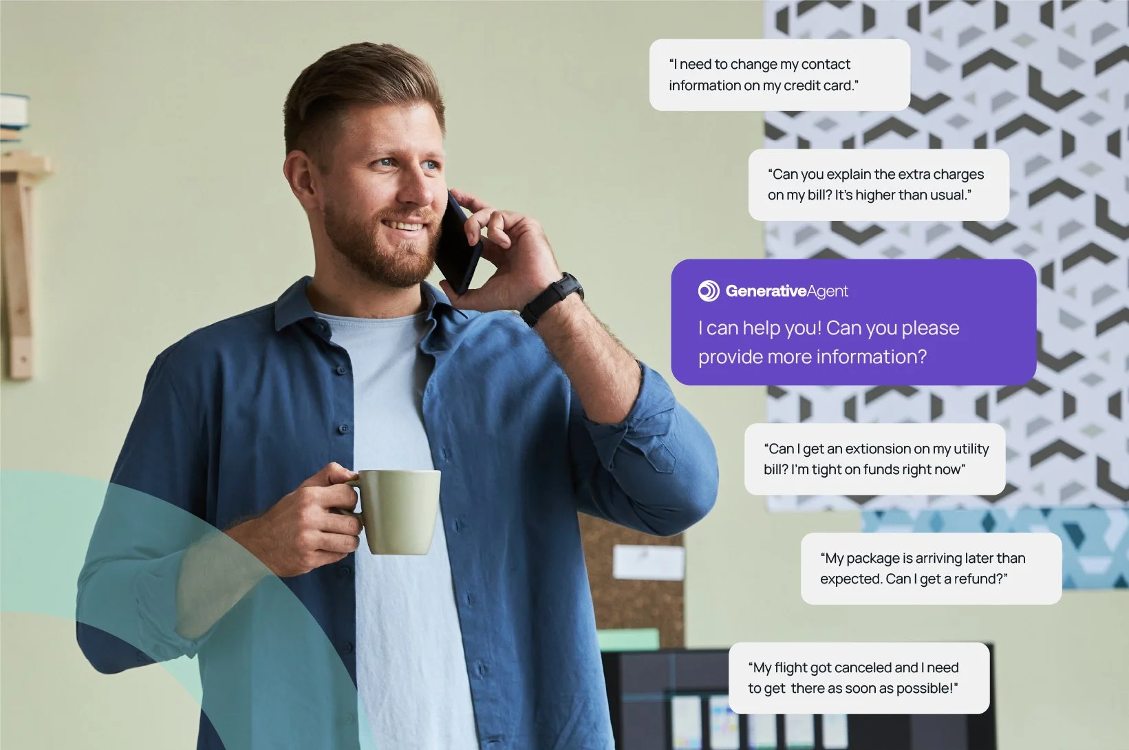
Finally, we reimagined ASAPP’s photography style. The old approach relied on black-and-white imagery with selective yellow accents. Our new direction is people-first by showing real users engaging with technology in relatable, authentic moments. This shift visually reinforces ASAPP’s customer focus across all brand touchpoints, including their website.
Software: Adobe Illustrator, Adobe Photoshop
Website Redesign - 2025
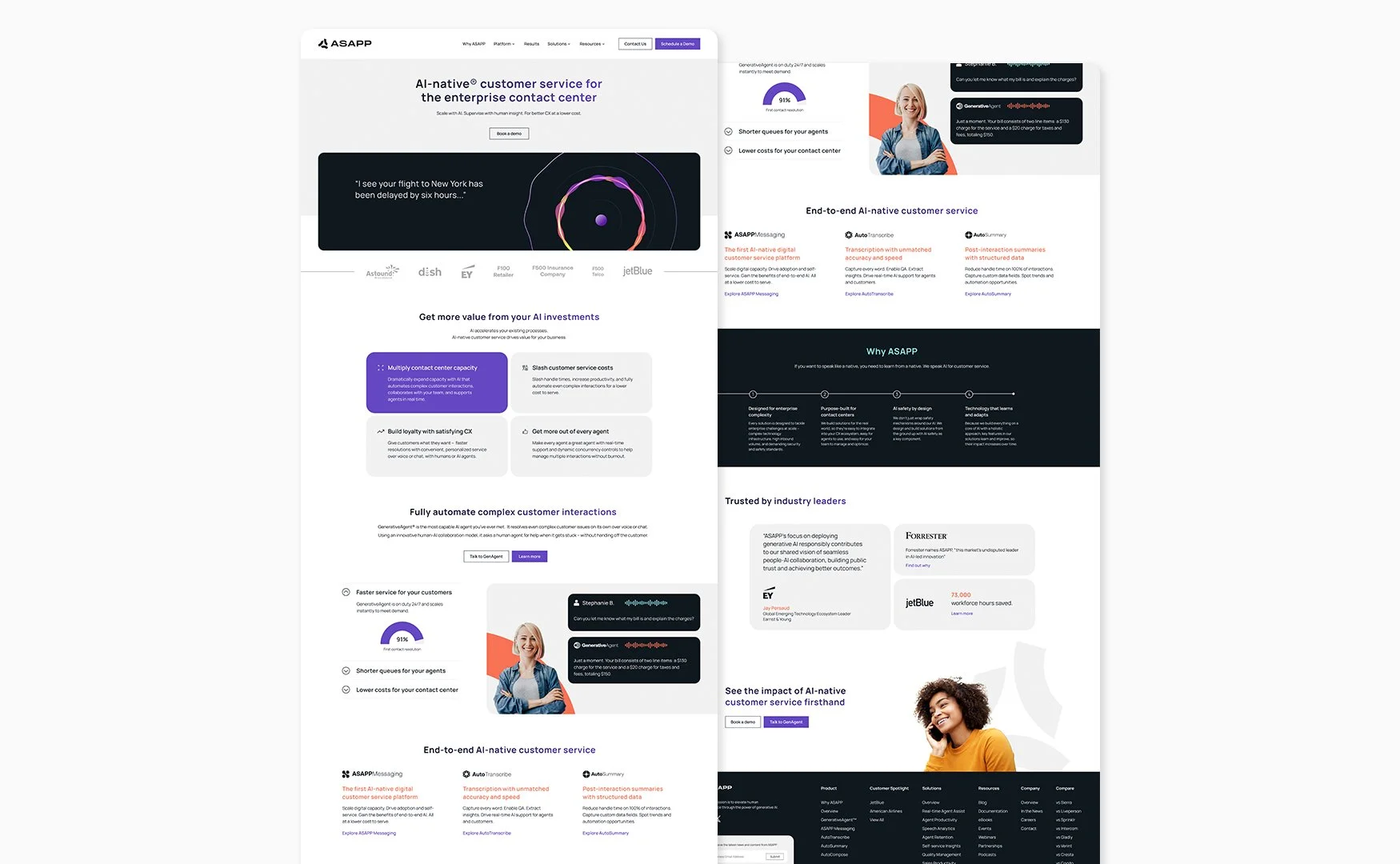
Alongside the brand refresh, Mitosis led a complete website redesign to bring ASAPP’s new brand to life. As a lead designer, I worked closely with the Creative Director to ensure consistency across every page and alignment with the refreshed visual identity.
I collaborated with the Mitosis team to design a cohesive, flexible component system rather than focusing on a single homepage layout. These modular components (including hero banners, accordions, three-column text blocks, quotes, calls-to-action, statistics, and timelines) allowed ASAPP to build pages dynamically while maintaining design consistency.
Once the core components were finalized, we assembled them into the homepage and product pages, refining layouts and interactions for a seamless user experience. I also designed key website assets such as button styles, the mega menu, and the footer for a complete, unified system.
Software: Adobe Illustrator, Adobe Photoshop, Figma
Two-Page document
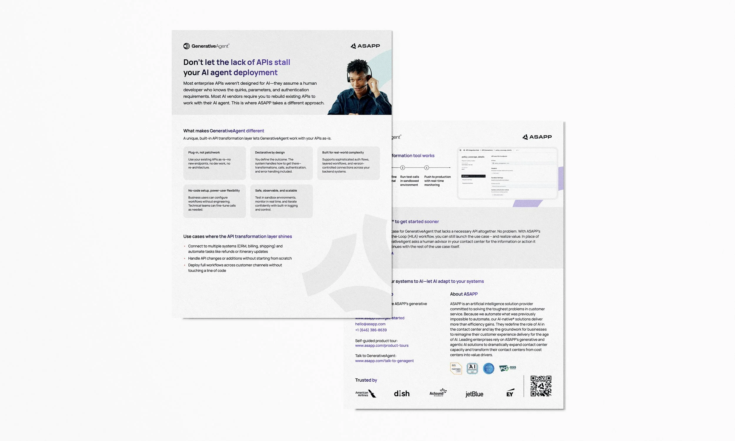
After establishing ASAPP’s new brand identity, we developed a template system for their two-page documents to ensure visual consistency across all materials.
We approached this project much like the website — by building a flexible set of components including headers, text blocks, quotes, calls-to-action, statistics, and footers. These elements could be easily rearranged to create new documents while maintaining brand cohesion.
One example, the API Two-Pager, serves as a featured summary highlighting one of ASAPP’s products by outlining its key features, benefits, and real-world applications.
Software: Adobe InDesign, Adobe Photoshop